


Everything posted by ArcticCrusher
-
 Breaking on CNN. Fucking dumb sheep.
 -
Not a good week for Neal.
-
Does Deepfaggot or Bambi care to face check this? I don't think so. The last video was viewed about 50 million times.
-
You should look up 15 min cities. These morons are fucking clueless idiots.
-
It should be sooner. Biden is just trying to push the grift.
-
"More than half of the women in my administration are women" - Joe Biden 81 million my fucking ass.
-
Veritas again with the truth. But let's keep our heads in the sand.
-
Your wife is correct and you're wrong.
-
I see the morons left this alone.
-
Here is John Campbell again explaining to the simpletons how many vax doses one requires to avoid one hospitalization. He also links the serious adverse rate for the mRNA vaccines of 1 in 800. Moderna's rate is 15.1 per 10,000 and Pfizer's is 10.1 per 10,000 for a blended total of 1 in 800. Can't understand why morons can't find this themselves. Keep watching CNN. https://pubmed.ncbi.nlm.nih.gov/36055877/
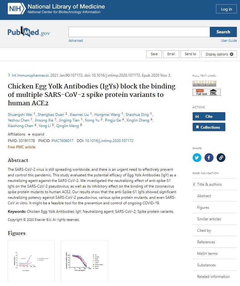
Guess what works better than the vax? Well anything really, but now egg yolk. Take that Pfizer. Maybe, just maybe the reason for egg shortages.
Did you look at the data? Of course not. I rest my case. Yes you are a fucking idiot with zero critical thinking skills.
Says who, you? This is why you're a fucking moron.
Hmmm, could be a problem no?
 That's why they wanted 75 years moron.
This is one of the reasons why your immune system is getting fucked and its not good. This is why you don't rush products to market. Unless of course you agree to being a lab rat.
No they did not test prevention or transmission. Where do you have that from? The original trial only tested a PCR result (170 ppl) thats it. All fraud. All bullshit. Remember more died in the vax group (21) than the control (17). Here is the FDA meeting where there is no data to support any claim of prevention of severe disease.
Sorry if the truth hurts. Anyone still pushing this nonsense today is a fucking moron and an idiot.
51 intel agents said it was Russian disinformation. Why would anyone trust them anymore unless they are a total fool? The laptop has been validated it was never in question.
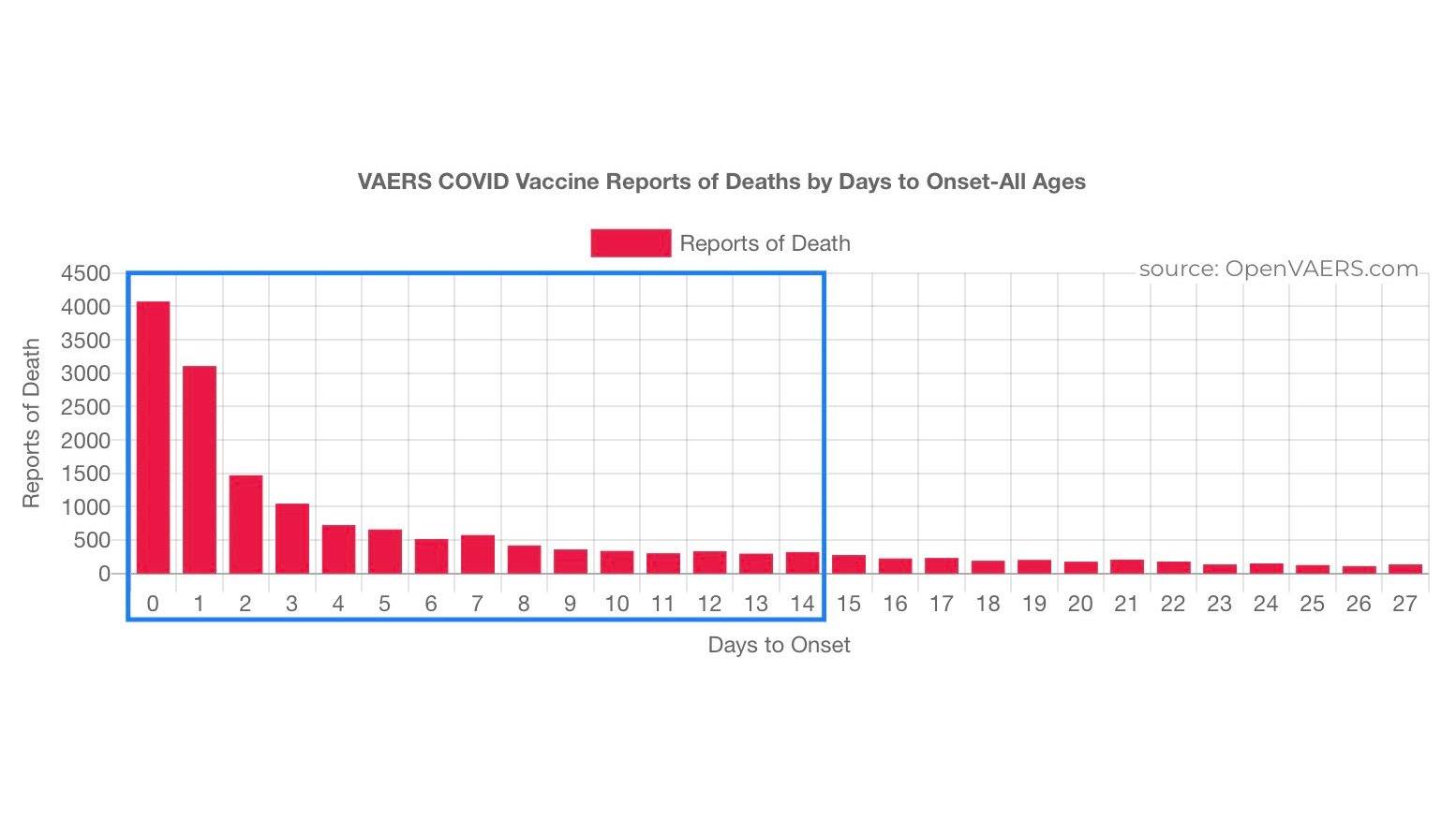
Most of those who died from the vax did so within the first 14 days of getting jabbed. They are counted as an unvaxxed death. Have you figured out the adverse reaction rate for the vax yet moron?
That's why they wanted 75 years moron.
This is one of the reasons why your immune system is getting fucked and its not good. This is why you don't rush products to market. Unless of course you agree to being a lab rat.
No they did not test prevention or transmission. Where do you have that from? The original trial only tested a PCR result (170 ppl) thats it. All fraud. All bullshit. Remember more died in the vax group (21) than the control (17). Here is the FDA meeting where there is no data to support any claim of prevention of severe disease.
Sorry if the truth hurts. Anyone still pushing this nonsense today is a fucking moron and an idiot.
51 intel agents said it was Russian disinformation. Why would anyone trust them anymore unless they are a total fool? The laptop has been validated it was never in question.
Most of those who died from the vax did so within the first 14 days of getting jabbed. They are counted as an unvaxxed death. Have you figured out the adverse reaction rate for the vax yet moron? At the recent FDA meeting it was revealed that any claims the vax had that made the disease less severe was all wishful thinking.
What % of covid deaths are with covid vs from covid. Start there moron
Sorry doesn't cut it.
At the recent FDA meeting it was revealed that any claims the vax had that made the disease less severe was all wishful thinking.
What % of covid deaths are with covid vs from covid. Start there moron
Sorry doesn't cut it.